
INFORMATION PUBLICATION DESIGN
DESIGN DIRECTOR AT MOXIE COMMUNICATIONS
DESIGN DIRECTOR AT MOXIE COMMUNICATIONS
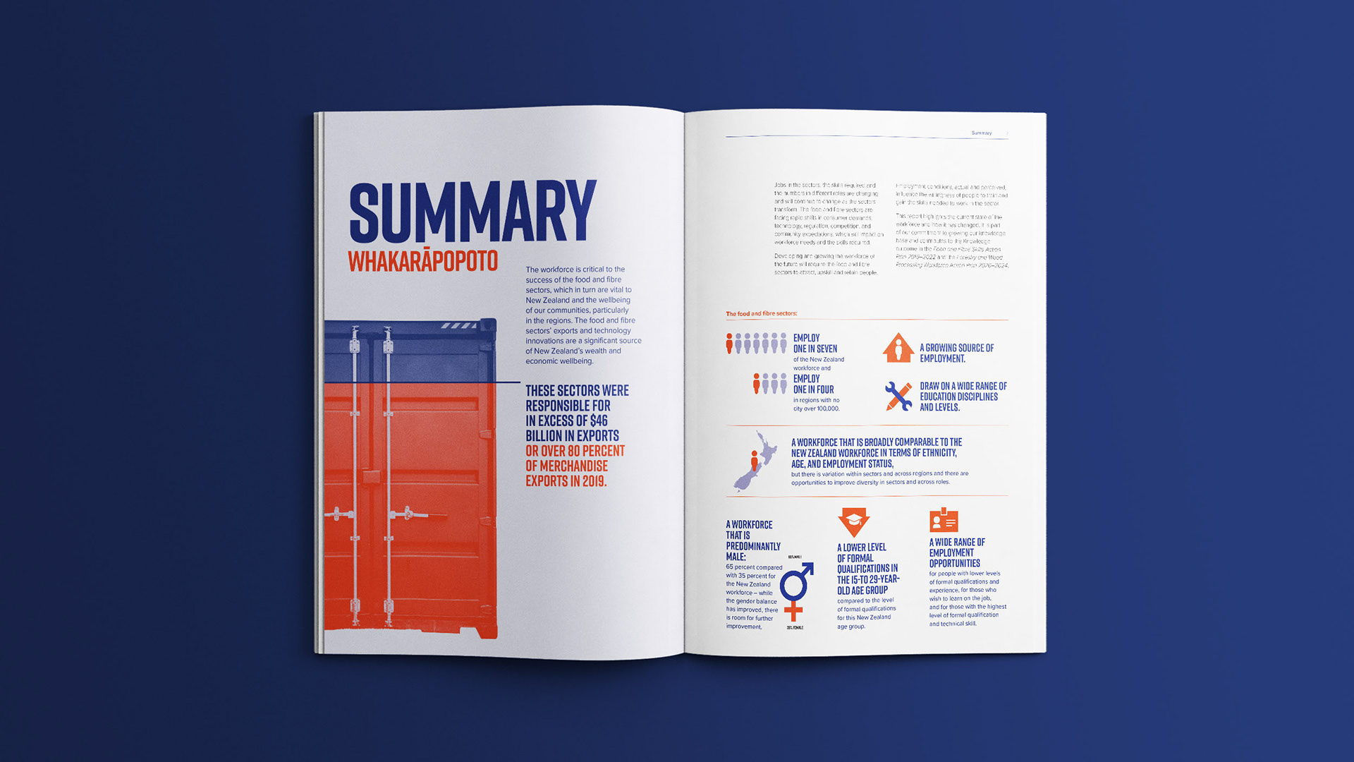
The client needed a publication design that would bring their important data alive in a contemporary and eye-catching way. They required content to ‘pop’, to be ‘punchy’, yet still easy to comprehend.
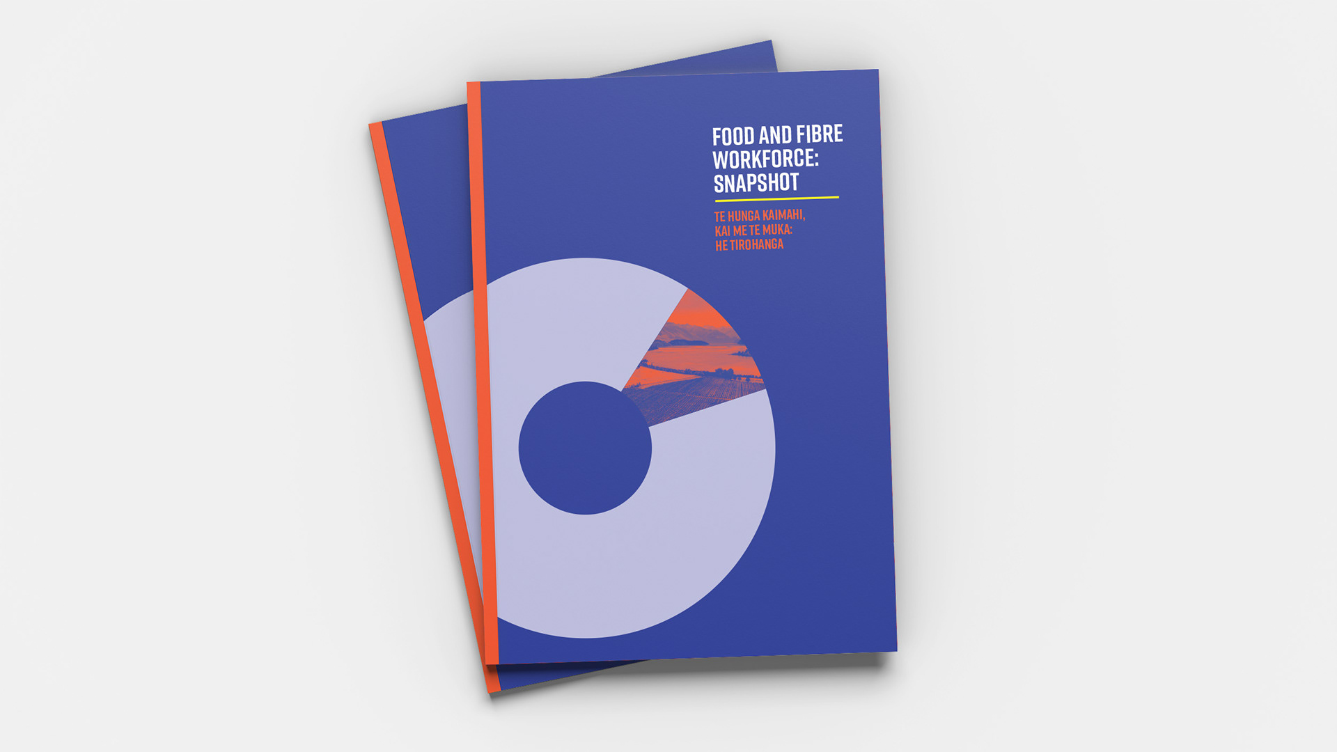
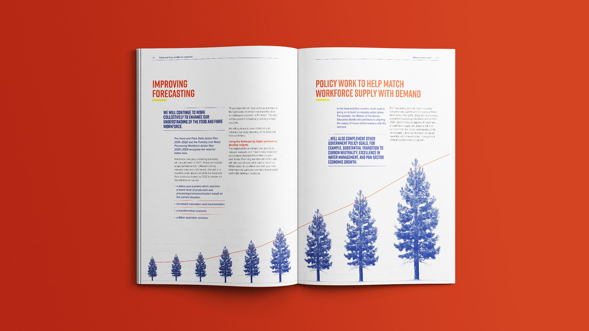
I paired a clean and distinctive sans serif headline font with a bold iconography style and took a collage-like approach to photography. These different elements were held tightly together by a restrained yet dramatic palette of only four colours.
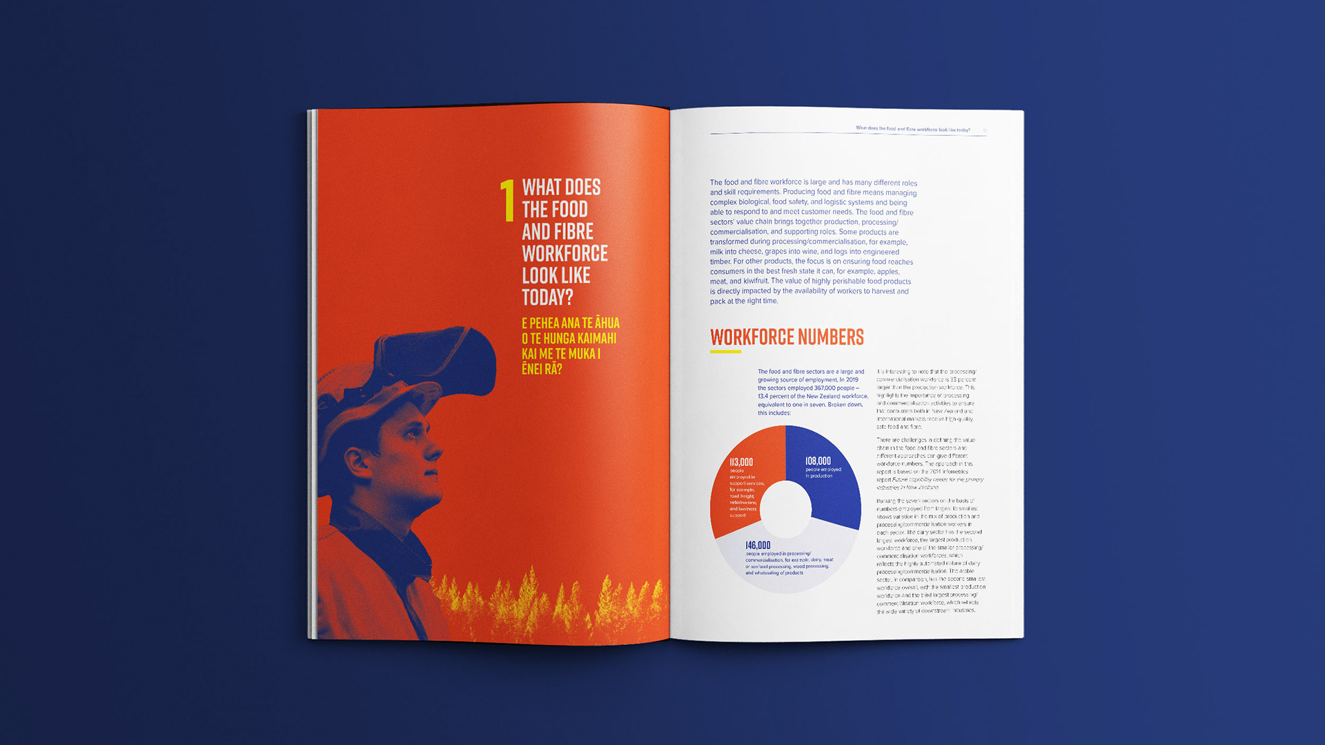
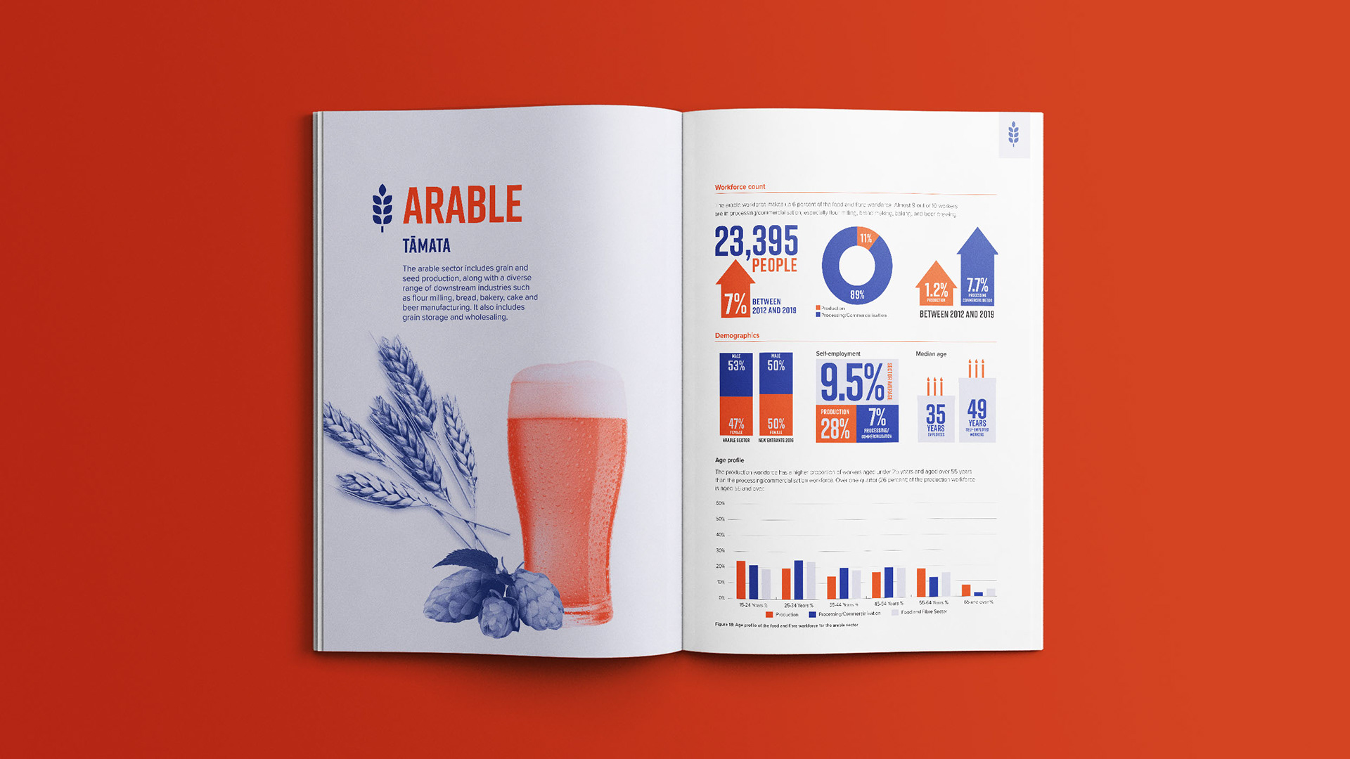
Due to the high data content of this report, the effective styling of the different graphs was crucial. I kept them clean and simple, allowing contrasting hero infographics to add impact to the page. Photographed objects were dissected by colour to convey statistics originally and memorably.
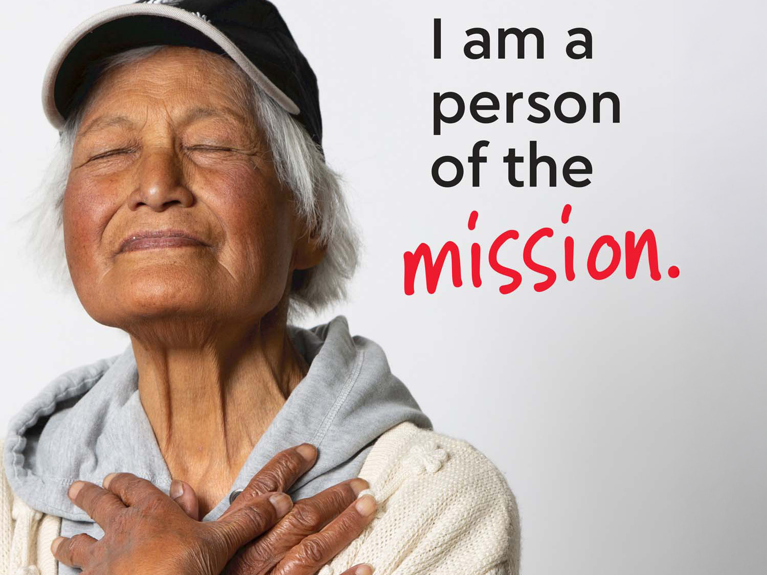
The report needed to capture the breadth of the sector. The collage-like approach to the photography successfully allows many objects to be juxtaposed in a striking way.
Our client was delighted with the report and received great feedback from the sector and the other agencies involved.