
BRANDING / ILLUSTRATION
DESIGN DIRECTOR AT MOXIE COMMUNICATIONS
DESIGN DIRECTOR AT MOXIE COMMUNICATIONS
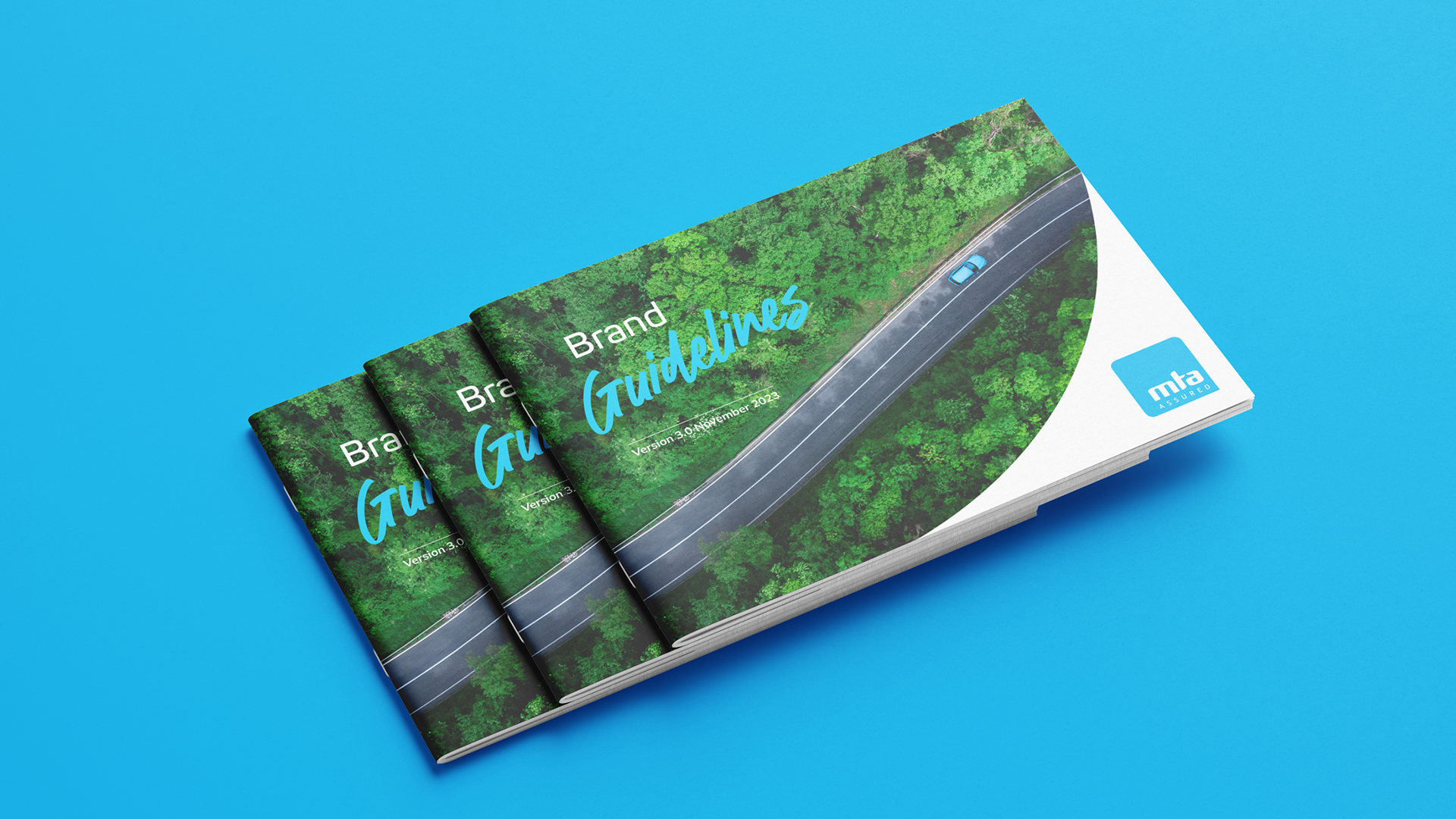
MTA required a brand refresh in order to bring their aesthetic more in line with their strategic goal of a cleaner, greener and more efficient motoring future for New Zealand.
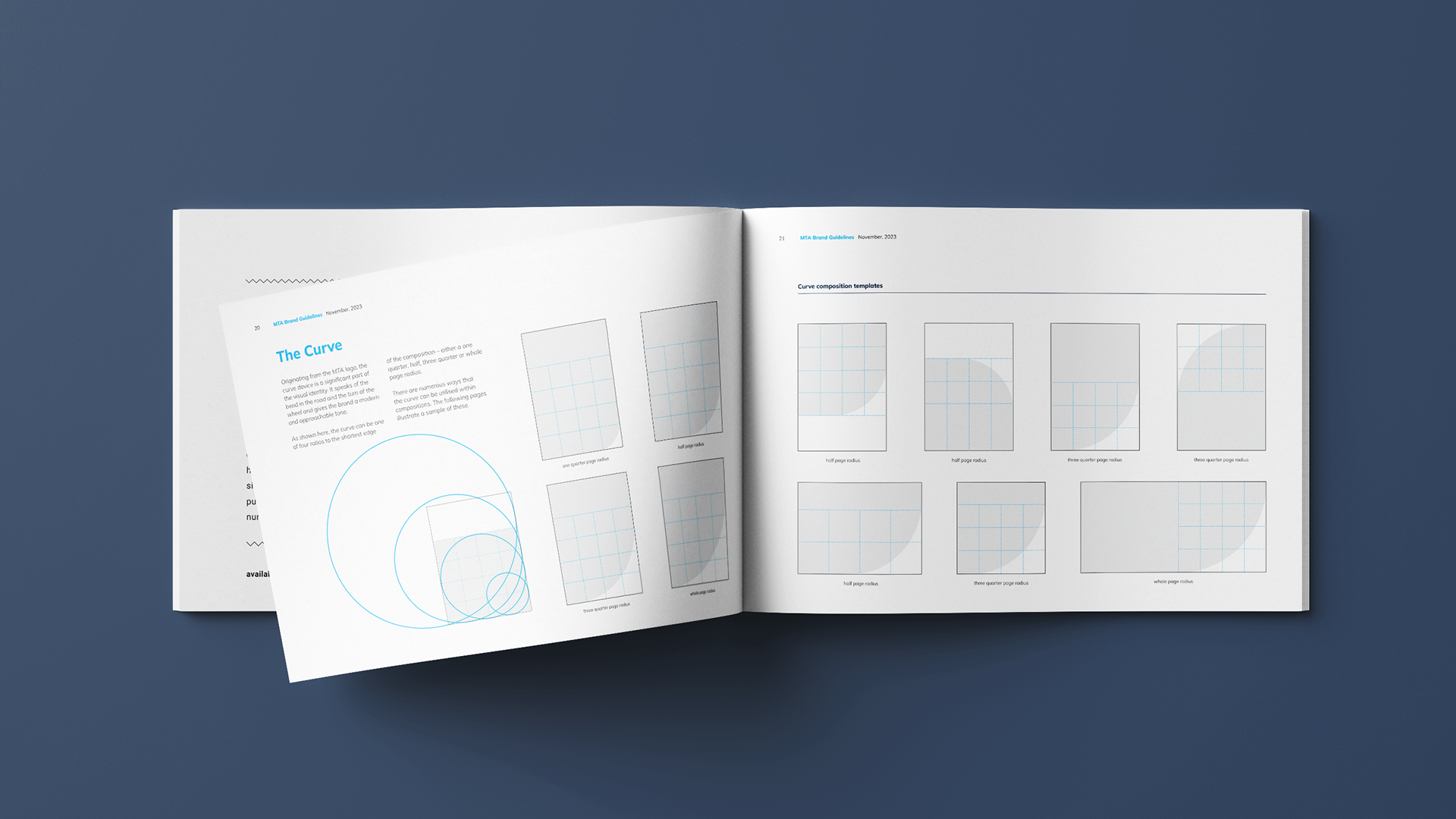
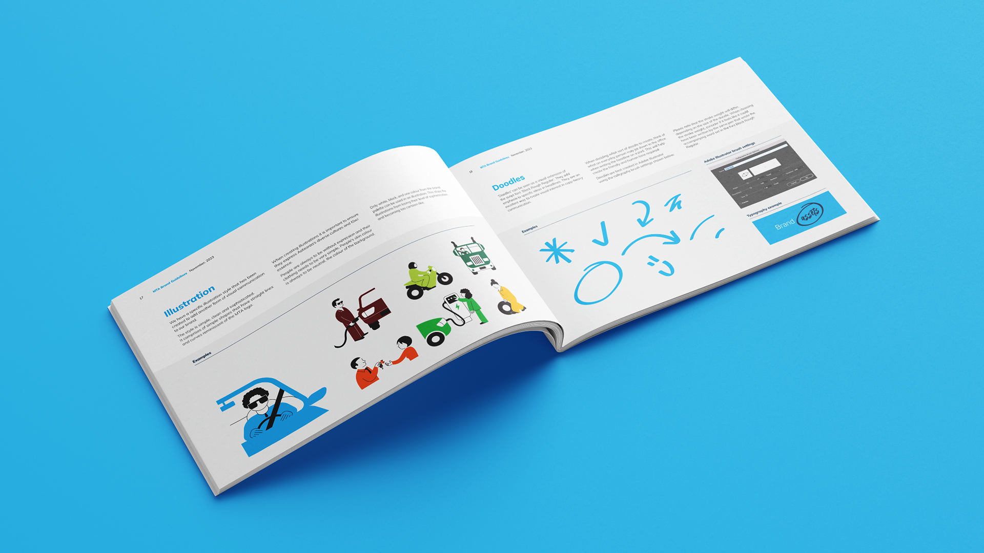
The new identity is based on a curve. This draws draws inspiration from the bend in the road, the wheel’s turn, and, most importantly, the MTA logo’s rounded corner. The existing MTA logo has been around for many decades and has strong public recognition. Using the existing brand blue, with this curve, was the springboard to creating a friendly and dynamic aesthetic that played on this existing brand recognition.
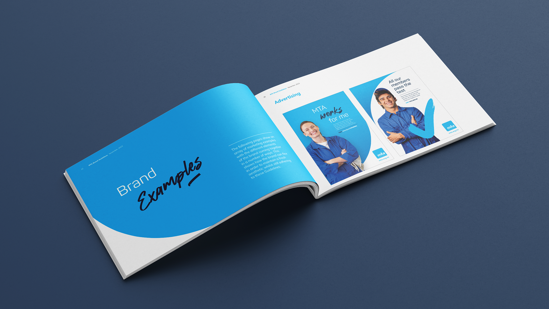
It was activated by introducing new visual elements, a contrasting and vivid secondary colour palette, and effective use of imagery, including photographic treatment and illustrative styles. I infact created a specific illustration style for them.
The addition of hand-drawn elements brought warmth and a feeling of the human touch — the idea that the consumer’s MTA member, who they’re trusting with their life, has checked things off, so they and their whanau are safe.
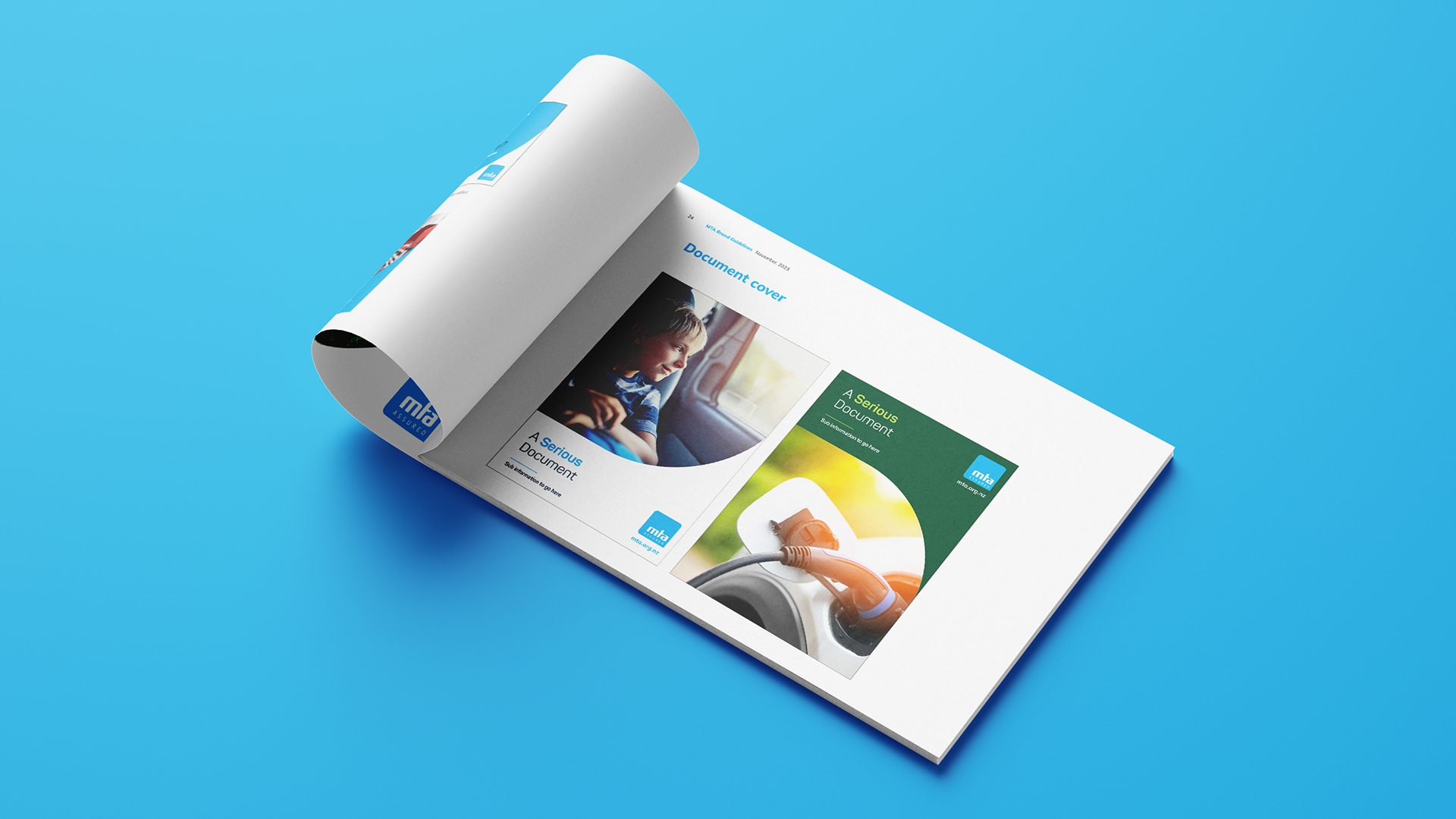
New brand guidelines, including the brand architecture, ensure consistency of application and clarity about where any new initiative sits in the brand context. The identity has been rolled out across the organisation’s brand assets and featured in recent successful promotional campaigns.