
BRANDING
DESIGN DIRECTOR AT MOXIE COMMUNICATIONS
DESIGN DIRECTOR AT MOXIE COMMUNICATIONS
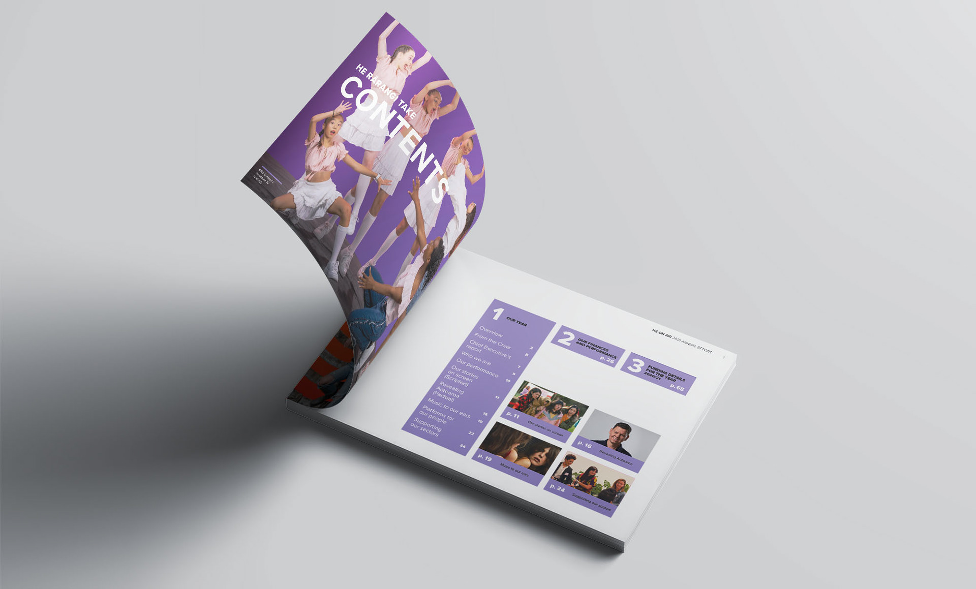
The organisation wanted to shift to a more contemporary look and feel to help inspire Kiwis to find funded content.
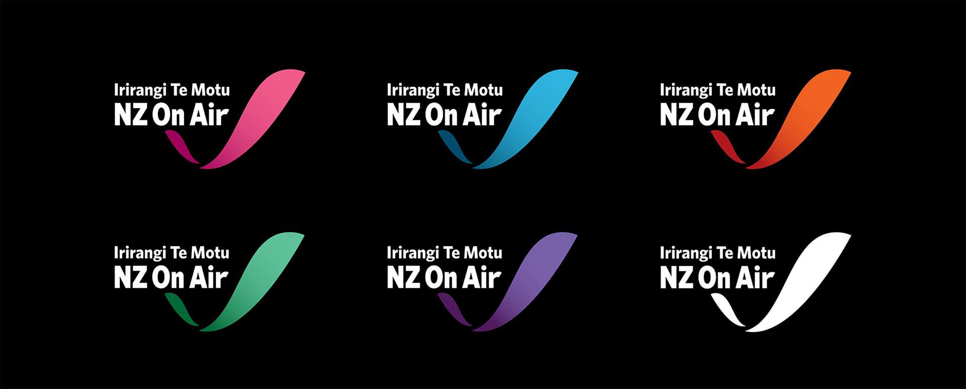
The first change was an update to the organisation’s logo — it was about 12 years since the last full update. The English and Te Reo names were given equal weighting. The biggest shift was moving away from the previous identity’s full spectrum of rainbow colours in the logo to a more punchy colour palette. The logo could be rendered in any colour from this palette as a solid colour, providing much greater flexibility to differentiate NZ On Air’s individual areas of activity and sub-brands.
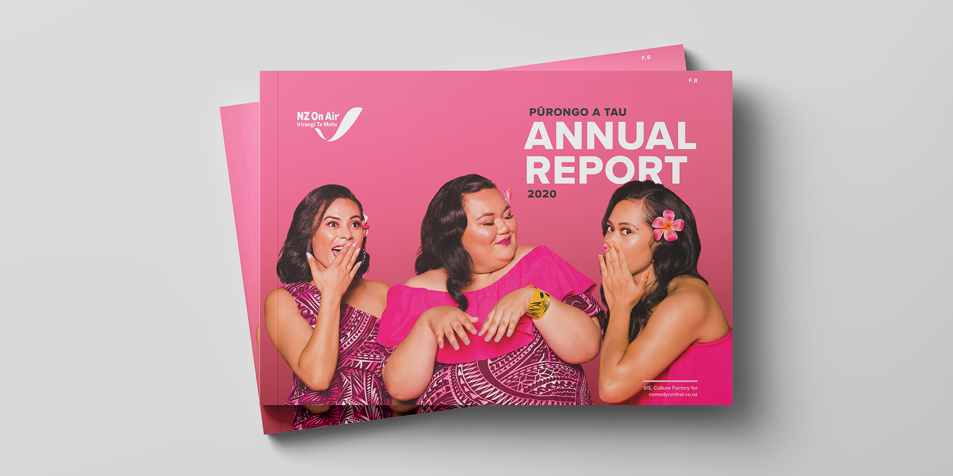
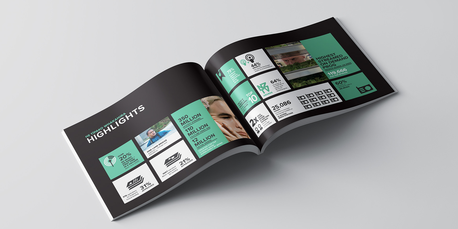
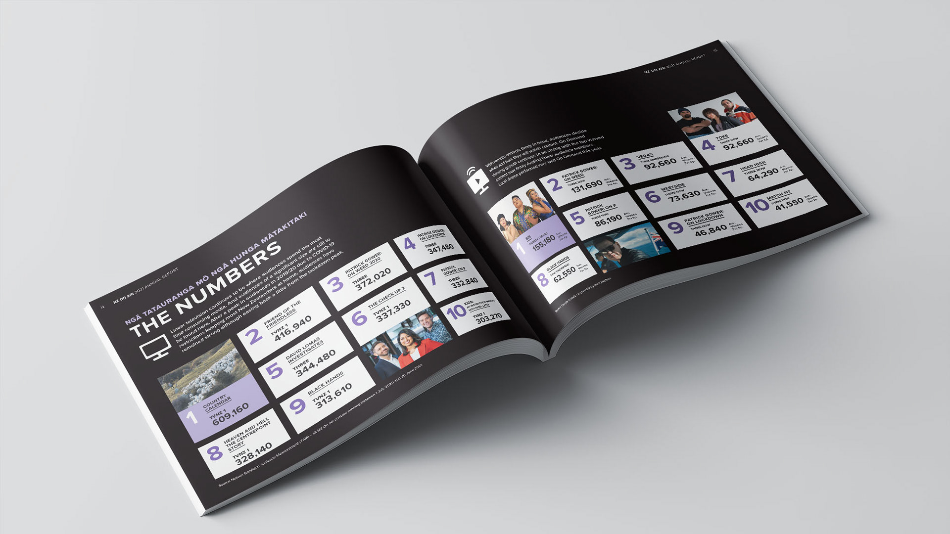
This new look has given their statutory reports new energy and increased impact. As they had access to amazing photography from a wide range of sources, I chose to replace all the photo backgrounds with bold popping colours, effectively unifying the different images into one visual family.